Sunday, March 23, 2008

Summer Camping


This is the last of the scrapbook pages that I have for you... at least until my scrappin' girls and I get together again (we aim for monthly with the occasional big event thrown in). This was the only double page layout I did. If you can't tell so far, I tend to do a lot of pages that have a lot of pictures on them. I guess that is because I take a lot of pictures, don't want to limit the pictures I use, and/or I don't want to scrapbook smaller sets of pictures and end up with that many more pages to do! I think it is a little bit of all of that. Here I tried to summarize the camping season for 2006 (yeah I am that behind!)...if you remember I did pull out a couple of sets of pictures from camping that warranted their own pages: Mud Puddles and Shining Your Light. The rest of the pictures are just a conglomerate of memories that pretty much speak for themselves...hence the no real journaling aspect.


At the last scrapbooking event I went to, I won a package of coordinating patterned paper with a bunch of coordinating stickers, die cuts, vellum, and embellishments that were all a camping theme! Unfortunately, I took the package apart to file stuff and did not record the manufacturer (and for some reason it is not printed on the back of any of the elements), nor do I have any idea where it came from. So I decided to pull this stuff out and use it for my camping page...this means very little stamping (only the Title was stamped) and I actually used Stickers (I know, this shocked me as well...I am not usually a sticker person).


Anyway, each strip of photos represents a camping trip: June, July, and August. My husband and I sort of head up a camping group of friends and family and we camp locally once a month throughout the summer. No backwoods camping...just your typical campground with campers, pop-ups, and tents...but it is a nice way to get everyone together to enjoy a relaxing weekend away. The photos are all the same height, but not necessarily the same width...again I just started cutting and figured it out as I went. I matted the top and bottom rows on different patterned paper from the pack and added the campfire and smore stickers with pewter brads (laid out with my ahndy Mat pack...love this thing!) in the empty spaces (had more pictures to show for the July campout). My minor journaling was to add little rounded tabs at the end of each row to share the dates and camping location. Then to give my page a focal point, I picked out a particularly cute picture of my son with his safari hat, matted it, added photo corners, and placed it on top of a vertical strip of patterned paper. The small yellow strip that says "Summer Fun" was from a larger peice of patterned paper that I just cut out and added. I added some more stickers {insert shocked face again!} on the left side of the page...the cute little flies. Lastly I stamped the title and year...mind you I was a little disappointed that I didn't center "Camping" very well, but I had already adhered the paper to the page! Oh well...can't be perfect all of the time...jk!!


The Engineering Details
Stamps - Bold Alphabet and Numbers; Paper - Unkown manufacturer patterned paper (coordinating pack), Chocolate Chip, Very Vanilla; Ink - Chocolate Chip, Chocolate Chip Marker; Accessories - Stickers from coordinating paper pack, Pewter brads (SU!), photo corner punch; Supplies - scissors, Mat Pack (SU!), paper piercer

Tuesday, March 18, 2008

A Birthday Weekend

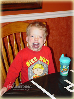
We celebrated my son’s 3rd birthday over the weekend. Still cannot believe that he is 3 already! I am constantly amazed at how much he has grown and learned in those 3 short years. He is a sweet boy that loves to giggle, jump, wrestle, snuggle (at times), and even tease (I think my husband’s and my sarcasm is rubbing off on him already!). Not that we have not had any challenges (sleeping or lack there of is one that we struggle with right now which figures because he was a good sleeping baby), but he is a joyful child full of fun and love! I just want to kiss him a bunch whenever I see him…usually getting the response of “Stop Momma” but then leaning in for more. I could talk about him all day!

For his big Number 3 celebration, I chose to go with a car theme. He loves Hot Wheels cars (actually recognizes the logo and looks for it on the bottom of cars), but since I don’t have Hot Wheels stamps and of course I need to make the invitations, I went with more of a general car theme. I posted the invitation I created already here. So I set out to decorate for his party to match the theme.
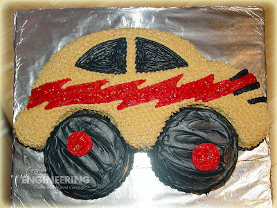
First I knew exactly what the cake had to be and yes (standing very proud right now) I made it myself! It matches the car used on the invitations from Stampin’ Up!’s retired set By Land. What do you think??? I baked the cakes one night and gave myself two nights to frost it…the drop stars taking up most if not all of the second night. They are time consuming, but they gave it a nice finished look! I cut the main car body out of a 9x13 sheet cake and made the wheels with a 5” round cake pan I got at a local cake supply store. I even found sparkle flakes (edible of course) at the cake supply store to keep my zigzag sparkly like on the invitation! When I finished it, I woke my husband from a peaceful slumber to show him…he didn’t give me the enthusiastic response I hoped for (more of a sleepy monotone “wow, that is great honey”), but he was asleep a second earlier…so what do I expect! (BTW – he gave me the enthusiastic response later the next day once he was awake)


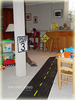
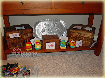
I came up with a fabulous decoration idea to go with the party…I believe I even called myself a genius as I told my husband about the idea. It turned out like I wanted it to, although I had a lot more “road” going throughout the house in my head. The 55 ft of tape, though, didn’t translate into as much as I thought it would, but it was effective and cute nonetheless. I had “road” upstairs (Ranch house) and downstairs (Family room area) and I made road signs and placed them at the eye level of a 3 year old! The road was made from landscape fabric and yellow & white electrical tape (the most expensive part of the decorations) from the home improvement store. The signs were made just with poster board and painted with acrylic paint. All of the wording and lines were free-handed in pencil first and then painted.


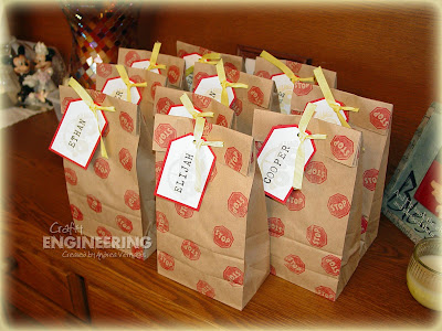
We had 10 kids total (including my son) so I made them each little gift bags which were filled with a Hot Wheel car (of course), Hot Wheels Fruit Snacks, and Hot Wheels Stickers. I kept the gift bags very simple, but stuck with the theme I started with on the invitation. I also created a little “Car Hunt” game in which every kid had to find 10 cards that had a car stamped on it with their names…2 each of 5 colors so that they could have a small “Memory” game to play later. Granted not all of them knew how to spell/read their names, but I think they had fun. Those that did recognize their own names displayed an extra amount of satisfaction in finding their cards…it was so cute! My son was in the latter group…he even had me go and hide his cards again so he could “find his name again”.

A couple of amazing moments during the party: 1) the quietness displayed by 10 kids (ages 4 and under) while they all ate pizza/cake at the same table, 2) my wonderful girlfriends for picking up the toys before they left (without me knowing!), and 3) the fact that we got a picture of all of the kids (remember ages 4 and under) on the couch…ahh the power of cake and ice cream!


So now after all of that, I plan to sit for a few days…my feet and back are still recovering!

Sunday, March 16, 2008

Want Some Cake?

Well I finally did it! I bought some unmounted stamps!! I have been looking high and low for a monkey stamp set for a future scrapbook page and fell in love with this set from C.C. Designs, Monkey Love. So I have had my first experience with acrylic blocks and I am looking forward to trying some acrylic stamps as well...already have my eyes on some!

Anyway, this card was created for two reasons: 1) as a birthday card for my nephew and 2) to submit for a C.C. Designs Design Contest. The contest involves people voting on the card they like best (starting March 21) and the winner wins all of April's new releases! So if you like, visit the gallery between March 21-25 and vote for me!!

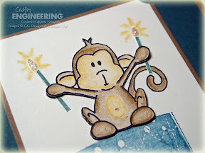
I needed a birthday card as I stated so I knew I wanted to incorporate a birthday cake or present. The little monkey looked like he was holding something in his little hands (or is it paws on a monkey?), so I came up with the idea for the naughty little monkey to sit on top of the cake and hold the candles. Only thing that would make it that much better is if I had a stamp that said "Want some cake?", but "Make a Wish!" will do! The cake and candles were stamped in Not Quite Navy (separately because the candles needed to be separate from the cake) and the monkey in Black two times (once on the actual card and once on a piece of scrap white). The Monkey was colored using Stampin' Watercolor pencils and a blender pen...I love the belly button addition!! I then cutout the monkey on the scrap white and layered him on top of the monkey on my main image...instead of using a dimensional I just used a small bit of cardstock to add a bit of dimension (thought the dimensional might be too much). The close-up image below shows this a little better. The only part that isn't a part of the top image is the tail. Then I added his candles and gave them a little sparkle with Diamond Stickles. Lastly was to add the greeting and the So Saffron Brads.


Speaking on birthdays, my little monkey (my son) had a birthday party over the weekend. I will post some pictures soon of some of the cool things I did...at least I thought they were cool! Until then, have a great week!

The Engineering Details
Stamps - Monkey Love (C.C. Designs), Birthday Whimsy (SU!), Mini Mates (SU!-retired); Cardstock - Close to Cocoa, Not Quite Navy, So Saffron, Whisper White; Ink - Not Quite Navy, So Saffron, Basic Black; Accessories - Ticket Corner Punch, Corner Rounder, So Saffron Brads, Stampin' Watercolor Pencils, Diamond Stickles; Supplies - Blender Pen, Scissors, Mat Pack (SU!)

Wednesday, March 12, 2008

Second Birthday Celebrations


Here is yet another of my scrapbooking pages that I completed during the overnight scrapbooking event...hopefully you are not sick of them yet (one more after this!). I am trying to spread them out some so to not overwhelm you with scrapbook pages.


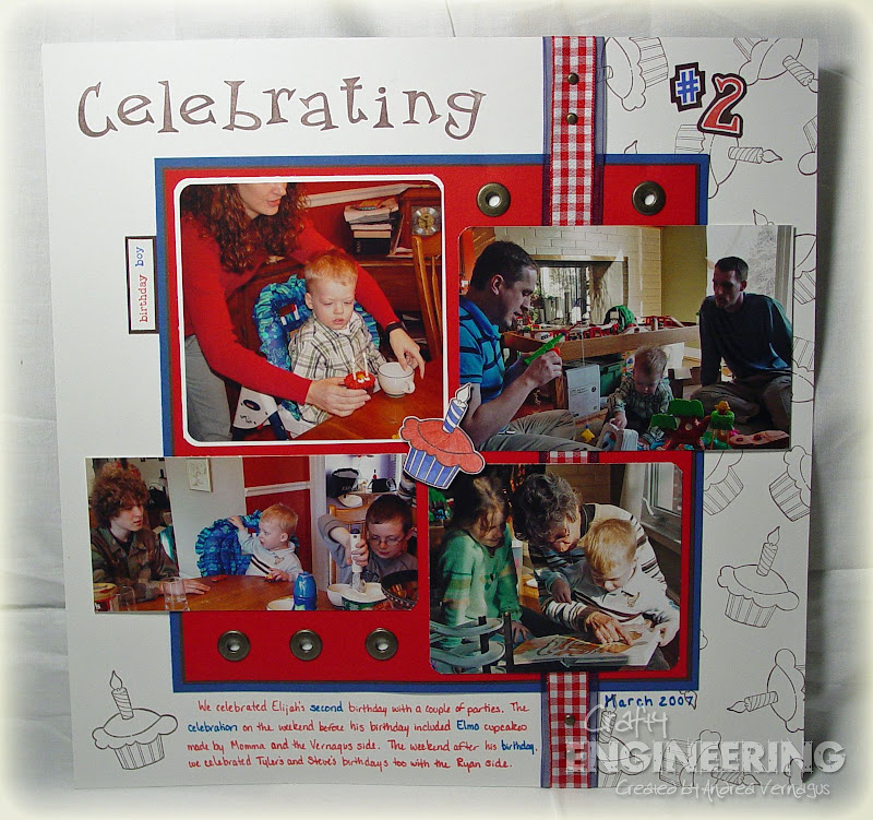
This one was a page that I was pretty much dreading doing. I didn't have the greatest of pictures and since we celebrated my son's 2nd birthday on two separate days with the different sides of the family, the colors didn't necessarily all match they way I would prefer. But I really liked how it turned out in the end.


Basically I picked up on a couple of bright colors that caught my attention in the photos: Red and Blue. To tame down the patriotic look a little, I added some Chocolate Chip. Since I made him Elmo cupcakes for one of the parties, I decided to borrow a friend's cupcake stamp to add some accents and background. The layout was inspired by some design elements I found in a scrapbooking magazine, but I didn't copy anything directly. I think the rounded corners on the photos was one of the design elements that I found in a magazine, which I proceeded to change to all of the corners in my red square had rounded corners, but the others did not. I am big into creating a focal point on scrapbook pages, hence why the one picture has a white mat behind it...your eye should be drawn there first and then around the page. The center accent cupcake was colored with blender pens and the ink pads and then adhered with a dimensional. The hardware accents (jumbo eyelets and brads) just give the little bit of extra pizzazz to the page. Well that is my insight into my thought process for the page. The little tab next to the focal picture was added last because that area felt too stark...a nice little added detail.


The Engineering Details

Stamps - cupcake (sorry, I have no idea...if curious I can ask my friend to look on the stamp), Quirky Alphabet & Numbers, Everyday Flexible Phrases; Paper - Whisper White, Chocolate Chip, Brilliant Blue, Real Red; Ink - Chocolate Chip, Real Red, Brilliant Blue; Accessories - Red Gingham ribbon (unknown manufacturer, but bought at JoAnn's), Navy Wide Organdy Ribbon (retired SU!), Antique Brass Jumbo Eyelets, Antique Brass Brads; Supplies - Blender Pens, scissors, dimensionals, Mat Pack (SU!)

Sunday, March 9, 2008

Pulling Out the Old

I really liked the Mojo Monday Sketch Challenge sketch, so I knew I wanted to play along, but man I had a hard time getting it started! I just couldn't figure out the right stamp set, so I ended up looking through what I had a pulling out an old one! Forgot that I like this set and I feel a sense of accomplishment for using some old sets!! When you collect the stamp sets as I do, I like re-finding sets that I own...but it does make me not want to get rid of anything...EVER! Never know when I might need it!!


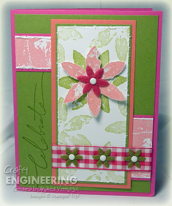
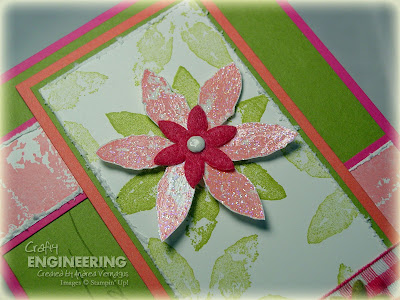
I wanted the flower to be the focal point, but it had to be on the long piece in the sketch. So I made the base Old Olive image full strength and then I randomly stamped around it, but stamped off first. Stamped the same image in Cameo Coral and cut it out to put on top. I painted some Crystal Effects mixed with Dazzling Diamonds Glitter on the Cameo Coral flower to give it a touch of sparkle...probably have to see the close-up image to really see it though. I just got the Flower Fusion from Stampin' Up! so I really wanted to use it and it had flowers in there the same shape as my main image. Perfect! Unfortunately, Stampin' Up! does not have white brads yet....why I have no idea...so I created my own by embossing white embossing powder on some silver brads. The ribbon is something I found in a dollar bin at JoAnn's at some point...no idea when though. The only other little touch I added was to rough up the edges of the main panel and the two little panels.


I have to say that I was very pleased with how this turned out...I actually showed it to my husband. Most of the time I don't show him anything, so I must have been excited to show it to him. The color combination was something that I kind of pulled together, but I have a feeling I will use it again...really like it!


The Engineering Details

Stamps - Paint Prints, Wonderful Words; Cardstock - Pink Passion, Old Olive, Cameo Coral, Whisper White; Ink - Old Olive, Cameo Coral, Versamark; Accessories - Flower Fusion Felt Flowers, White embossing powder, silver brads, pink-checked ribbon (JoAnn's), Crystal Effects, Dazzling Diamonds Glitter; Supplies - scissors, dimensionals, paintbrush

Wednesday, March 5, 2008

Shining Your Light

If you haven't noticed by now, my girlfriends and I set up a couple of themes for the overnight scrapbooking event that we attended: camping/summer and birthday. I only had one birthday to scrapbook (a post to come), but a lot of camping pictures (and I still have one more page to do of camping!). In this installment of camping pictures, my son discovered his flashlight. It was hilarious to watch him turn it around and try and figure it out...all while in his cute little camping chair!

So since the flashlight was the focus of the page I tried to represent the title in a beam of light from one corner to the other. I got help on this one. Sue from Perfect Cuts (I think she just travels around to events like this and sells stuff already cut and will gladly help you create something) cut this title out on her fancy machine and cutter...no idea what program or anything she was using and he does not have a website (if interested, I can look up her phone number or email...just leave me a comment or drop me an email). Anyway, I described to her what I was thinking and we went from there. $3 later and I had my "beam of light" title! One benefit to scrapbooking events when vendors are there!

I knew I wanted some sparkle to the page as well. So I matted all of the photos on Summer Sun cardstock that had been in embossed with Iridescent Ice embossing powder (love this stuff!). I also added some Diamond Stickles to the large star at the center of the "O" in the title. Finally, I placed star accents around the page: the black stars are from the Anchored Rub-on pack and the yellow ones are from leftover from the letters being cut-out of the title. That is about it!

The Engineering Details
Stamps - None; Paper - Basic Black, Summer Sun; Ink - Versamark; Accessories - Iridescent Ice Embossing powder, Anchored Rub-ons, Diamond Stickles; Supplies - heat gun

Sunday, March 2, 2008

Flamin' Car Invite

O.k. today I am feeling very pregnant! I am only 25-1/2 weeks, but man I feel very pregnant! I think it was the fact that I completely wore myself out vacuuming my house! Yeah, sad I know! Oh well, just needed to complain.

On to the subject at hand. I finally finished my son's 3rd birthday invitations and I am pretty pleased with how they turned out! He is having a car birthday...no specific car, just cars in general. I have some great ideas in my head for decorating for his party...I will share after the party...so excited! The invite turned out to be a gate fold card where the STOP sign is what is holding the card closed. You can see this a little better in the images below.


I used the By Land set that is retired from SU! to make my car. Stamped once in black and once in So Saffron and cut the So Saffron one out and popped it up on the black. I cut some Real Red paper to look like a cool zigzag...was originally suppose to be flames, but I couldn't get them to look right...and added that to the car. I also added some 1/4" circles to the wheels. All of the Real Red car accents got a dose of Diamond Stickles. I used the Sanded background stamp in Real Red with some dot accents in black on the background. The Stop sign was matted in black and popped up with some dimensionals. That is really all for the details.

I showed it to my son and he said "I'm having a car birthday!"...guess he figured out the theme! So funny! I will share a couple more scrapbook pages this week and hopefully a sketch challenge if I can get it done. Have a great week!

The Engineering Details

Stamps - By Land (retired), Sanded, Simple Shapes (retired); Paper - Real Red, Basic Black, So Saffron, Whisper White; Ink - Basic Black, So Saffron, Real Red; Accessories - Diamond Stickles, 1/4" Circle Punch; Supplies - dimensionals, scissors

Related Posts with Thumbnails